Publications
Calligraphy as Art and Meditation: A New Approach
- Hardcover, concealed spiral binding,
272 pages, 8¾" x 11½" - Available for purchase from John Neal Bookseller for $29.95 (with free media mail shipping, US only).
Order online at www.JohnNealBooks.com - Also available from Amazon and Barnes & Noble.
- For all levels:
from pure beginner to seasoned professional - My audience:
adults, adolescents & children, meditators, teachers, therapists, graphic designers & artists
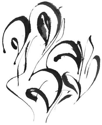
About this bookI would like to introduce this book’s major, innovative features. By perusing them, I hope to expand your ideas about calligraphy’s potential for artistic endeavor and the practice of meditation. These are not mutually exclusive! Two essays about this bookTo help you discover calligraphy as an art for our time, my book offers a foundation for developing calligraphy as art, as mental exercise (a creative one!), and as meditation (a moving meditation integrating the breath with stroke and letter making). Conventional approaches focus on letter form. They don’t provide training for its vitalizing agent — flow: the source of form’s energy, movement, and spirit. This book merges the essentials of form (design and structure) with those of flow (rhythmical movement and sensitive touch). Here, you enter a process of becoming present as you open to a holistic calligraphic experience. Your product is organic, the natural result of paying attention through an embodied, creative act. My aim is to help you create living letterforms: to give letters life as you awaken and cultivate a more vivid sense of your own life.
Approach to learning
“One-point tools,” p. 9
“Ink meditations,” p. 244
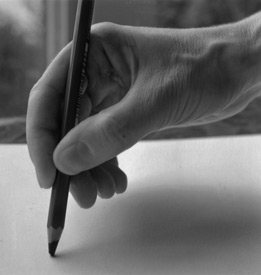
A tool-centered approachIn this book, practicing letterforms is inseparable from wielding the tool that makes them. Fundamentally, it’s through the use of a tool that you infuse letters with the calligraphic essentials of energy, rhythm, and feeling. Here, four different types of tool introduce you to these qualities. You develop them through specially designed “training alphabets” (see below). The tools and materials needed are introduced in the course of the tool introductions and alphabets. 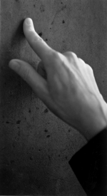
The Prototool
Holding the tool
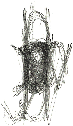
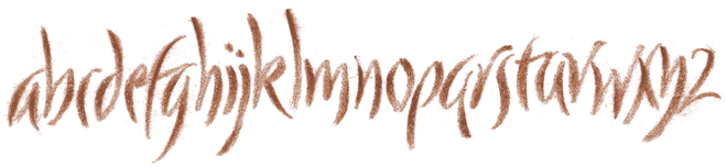
The Prototool: Beginning with your index finger, your body makes direct, unmediated contact with a surface. This experience with touch and movement prepares you for using an actual tool — for guiding strokes as an extension of your body, as expressions of your own body’s unique language. One-point tools: Pencils and roller balls. These familiar tools help you get comfortable with moving and directing a tool. Making basic directional strokes with them, you become aware of the quality of your movement — its energy and potential for connecting you with your mood and spirit. “One-point tools” includes sitting at a desk, posture, paper, and tool hold. This tool category features the training alphabets of Playball and Jumprope. (see below) Stroke technique: The Conte crayon. This tool, a one-point tool with “bite,” helps you develop the quality of your contact with a writing surface. It works by awakening your senses to the pressure you exert upon a tool as you move it. The quality of your contact develops through exercises in applying and releasing pressure in patterns (even and uneven). It’s the key to finding calligraphic rhythm! Using a tool with bite, the skillful use of pressure helps you participate in the “elasticity” of the stroke. Connecting with it in this way you receive its energy as you give it your own. Vitalizing letterform is a reciprocal act! Start pressure — the first uneven pressure pattern. 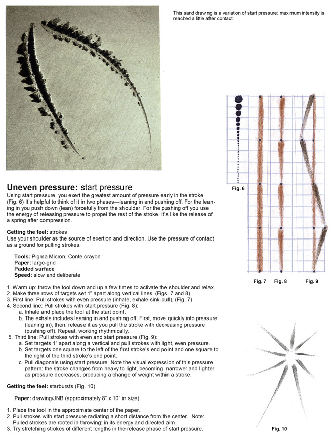
“Graphopoeia” is a term my husband invented to describe the calligraphic process of translating a word — an aspect of its meaning — into visual as well as written language. In creating the word as an expressive image you develop both the basics of design and “calligraphic empathy”: an ability to identify with the direction of strokes and the posture of letterform as a felt experience. Using the Conte crayon and “Jumprope,” the second training alphabet, you begin to explore the realm of calligraphic empathy. The first stage is literal interpretation, as in the word images below. This begins a process of cultivating your ability to experience written/verbal language in terms of graphic elements and felt gesture. 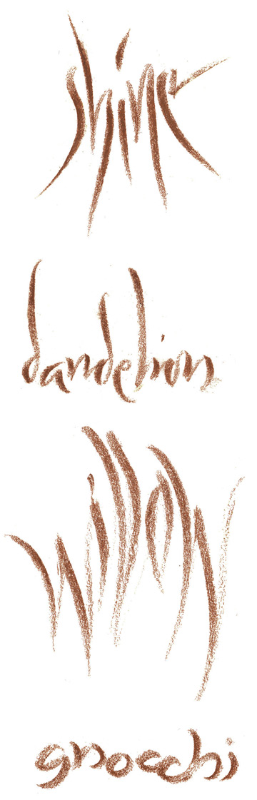
Graphopoeia
Two-point tools: Two one-point tools banded together. These comprise a shaft and a nib with two points. This nib is analogous to the edged pen’s two-cornered nib (see “The Edged Pen,” below). Two-point tool operations underlie both tools. Beginning with a two-point nib, without the challenges of using ink, prepares you for success and enjoyment with the more sophisticated edged pen. Two-point tools introduce partnering technique, see below. Using this technique, you partner with the tool, the better to dance with it — to more fully engage with and enjoy your movements! 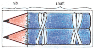
A two-point tool
Page 86, below, provides a basic “operator’s guide” for using a two-point tool / edged pen: the key — understanding nib angle. 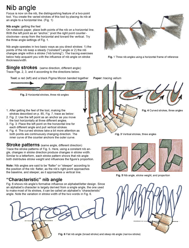
Stroke techniquePrototool 2: This prototool features the index finger (IF) and thumb (T). Its use of fingertips are analogous to the twin points of a two-point tool. (Later, the corners of the edged pen.) Both Prototool 1 and 2 can be used to get the idea of an exercise before picking up an actual tool. Partnering: Partnering develops command of the tool through a mental connection between fingers and nib points (see below). We imagine the thumb (T) and index finger (IF) paired with the tool’s left and right points. The use of such partnered points gradually translates into skillful and expressive letterforms. 
Mental partnership between the fingers (T and IF) and nib points
Partnering exercises for two-point tools
Partnered play on one and two points
The edged pen: A shaft with a distinctive nib: an edge bounded by two corners (the points of a two-point tool). 
Analogous tools: the edged pen and the two-point tool
Although an edged pen may carry its own ink (using a cartridge design), in this book you’ll learn to load ink by dipping the nib into an ink well. There are step-by-step instructions for this process, for preparing and cleaning the nib, and for starting the flow of ink. 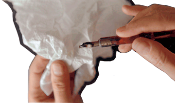
Cleaning the nib, step one
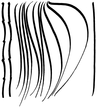
In this tool introduction you’ll get acquainted and comfortable with the many-faceted edged pen. Meditative exercises help you integrate breath, body, and ink flow and, in the process, refresh and relax your mind-body. Through such guided play as seen in the long-line exercises below, you can explore the pen as you participate in the rhythmical flow of strokemaking. Engaged apart from the letterform, these exercises develop your sensitivity, awareness — and confidence! 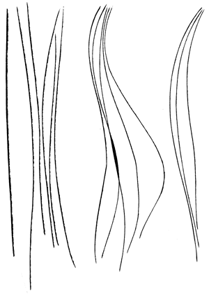
Thin-edged arcs (above)
Ink “toccatas”: sensitization with broad-edged arcs (below)
Training alphabetsThese are primarily invented alphabets rather than historical ones. They are especially designed 1) to cultivate the calligraphic lessons of each tool and 2) to train the eye to see alphabets as artistic languages. To help you explore these visual languages I’ve created a grammar I call the three Ds: design, ductus, and dynamics.
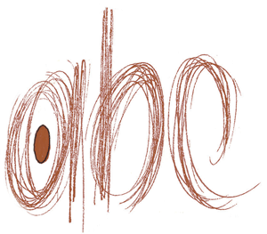
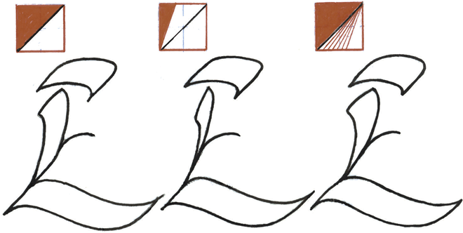
This figure illustrates the principle of unity by coloring in a repeated element: an oval shape or portions of it.
Through the interplay of the three Ds you learn to express yourself calligraphically — awakening your aesthetic potential as you activate a dialogue between the senses, visual and tactile; bodily movement, and the mind. SpacingIn this approach, spacing is an integral, organic part of studying an alphabet: not, as in conventional instruction, taught at the end. From the start, you’ll learn to see the space within a letter in relation to the space around and between letters. Individuals (letters) become social (words and lines) shortly after their birth as unique forms. 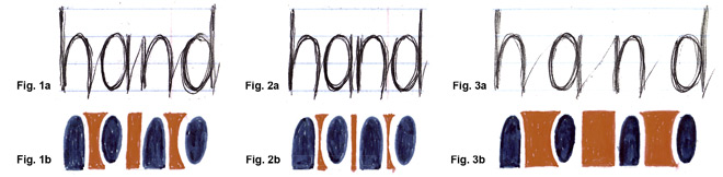
Investigating space
Spacing and Legibility
PlasticityCalligraphy is not type! Plasticity — the inherent ability of calligraphic strokes to lengthen, shorten, and subtly change direction — helps you make legible texts as well as expressive ones. ExercisesThese learning experiences are the heart of this manual. They aim to develop your ability to 1) infuse form (the structure of a letter) with flow (the energy and rhythm that brings a letter to life), and 2) to organize letters into calligraphic pieces — whether a single word, line of words, or multiline text. AttitudeHere, an open mind helps you enjoy learning — indeed, makes it possible! Please take a vacation from your past experience with calligraphy — whether a definition or years of practice. Go on vacation and let your natural curiosity energize you for an exploration of new territory. As meditation, this approach asks you to notice any thoughts that prevent you from being present. It asks you to slow down. Practice is a time to breathe — to discover, develop, and delight in your wholeness and creativity. 
Where the spirit does not work with the hand there is no art. Leonardo da Vinci
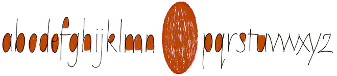
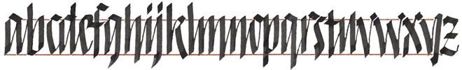
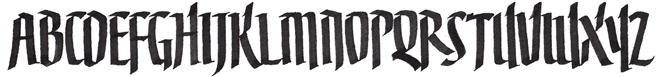
The alphabetsGrouped by tool category, the eleven training alphabets in this book are briefly described below. One-point
The multiline stroke of Playball.
Playball becomes an alphabetic “workout,” or a meditation, when the letters are thrown one atop the other.
Jumprope
This book introduces “bowing” technique for calligraphers as a way for developing strokes as felt gestures. 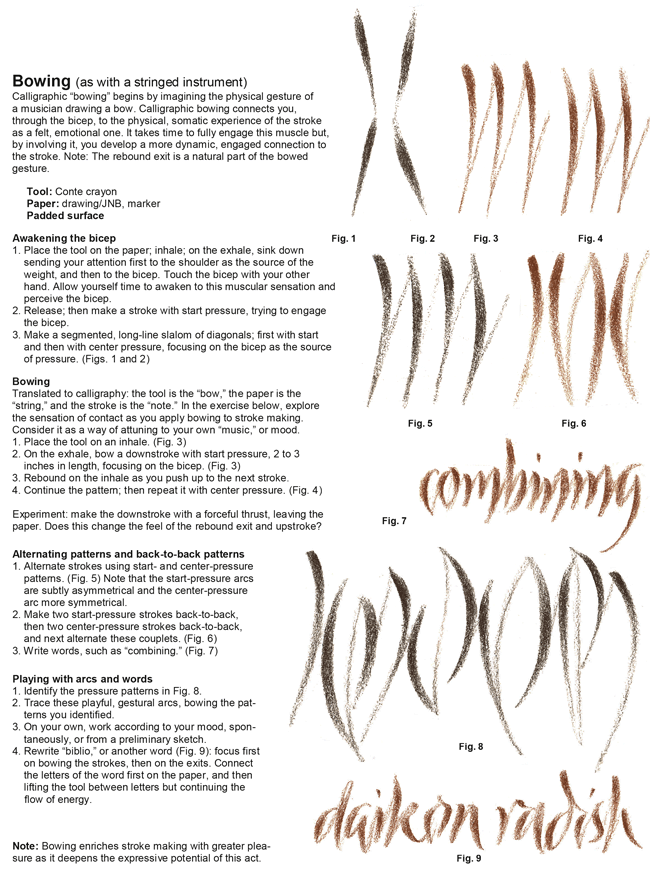

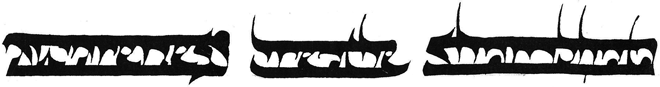
Jumprope caps with dots over enlarged lower-case forms.
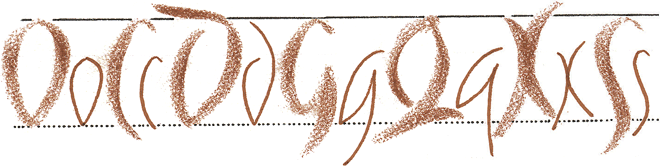
The “O” letter family with lower-case
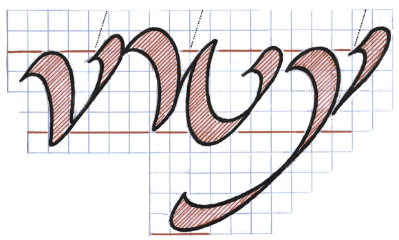
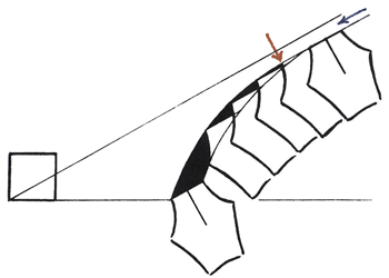
“v” family letters show how, given a constant nib angle (thin red lines),
variations in stroke thickness result from changes in stroke directions Trapeze also activates a spirit of daring and play as you move frequently from one to two points to close the open stroke of a two-point tool. 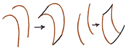
Trapeze develops partnering, described in “Two-point tools” above. Partnering makes it easier to guide the tool—to experience “disciplined freedom.” Trapeze continues to investigate the word as image. In the exercise below, you 1) choose a word, 2) trace its letters from the model alphabet; and 3) explore its expressive possibilities using plasticity (line and spatial relationships). 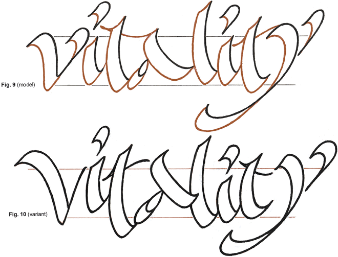
A black dot over a character indicates an enlarged lower-case letter.
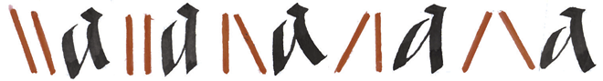
Alphabet/letter design — the downstroke from left to right: “characteristic,” “adjusted,” and “turned” nib angle.
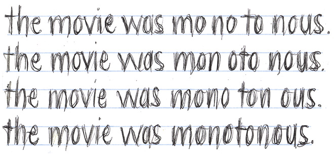
Moto
Moto continues our exploration of the word as a communicator of graphic meaning and the interrelationship between the verbal and visual. 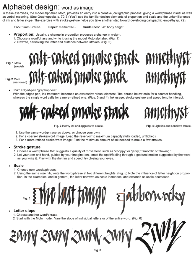
Moto Caps
You’ll also learn to draw “angle lines” as aids to maintaining nib angle. This process introduces the use of protractor and T-square. 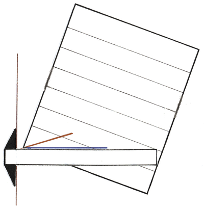
And, you’re now ready to begin nib turning with the edged pen. Here, you change nib angle within the course of a single stroke to thicken it. 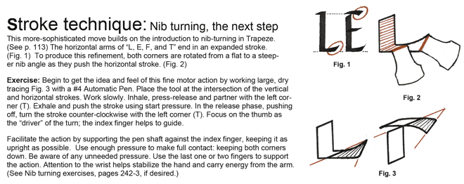

Satisfaction
In Satisfaction, calligraphic exploration focuses on letter structure.
Moto, top; Satisfaction, bottom.
Letter structure joins other design variables to expand expressive potential. 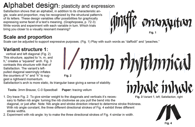
Satisfaction caps: a red dot over a character indicates an enlarged lower-case letter.
Two plastic relationships are considered as expressive choices: 
Cap height relative to lower case
Letter part to whole
Introduction to ItalicIn contrast to the previous training alphabets, Italic is historically-rooted rather than invented. It’s presented here, at the end, because students now have sufficient skill to enjoy learning this sophisticated hand. The two versions — Upright Italic and Proteus — provide lessons in more advanced calligraphic techniques: ones which will allow you write an Italic of your own design or follow that of another. 
Upright Italic, above; Proteus, below
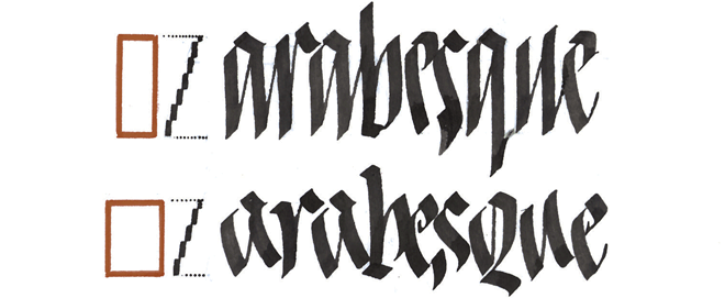
The graduated stroke: the change from a hairline stroke (nib corners in alignment with stroke direction)
to an expanding stroke (nib corners not in alignment with stroke direction). 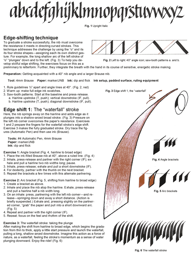
Upright Italic also features nib turning within and between strokes.
Proteus is composed of two alternating alphabets: Proteus 1, at 40°, and Proteus 2, at 60°. You begin by practicing these separately and then combine them. 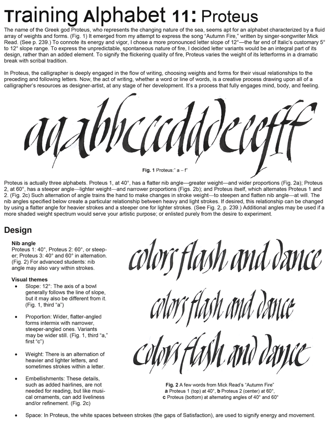
Proteus also features an in-depth look at the reverse curve. 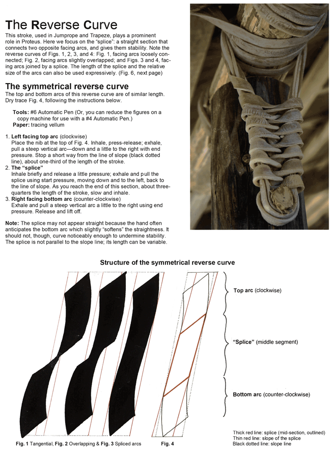
Proteus expands your graphic palette by introducing partial-edge technique (see below). Here, a sophisticated use of nib corners creates rough-edged strokes of varying widths and lengths. Cornering technique allows you to smooth them, if desired, depending on your purpose. 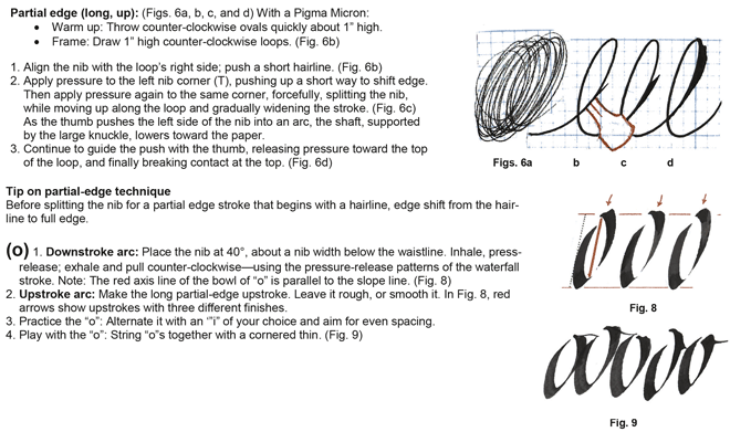
“Making”Most of the training alphabets also give instruction for making a finished piece. These include a simple label, personal “reminder,” a scroll, and a multiline text. I use the word “making” to imbue this process with the spirit of a line from Robert Bridges’ poem: “I too will something make/And joy in the making.” These learning experiences offer a step-by-step method which includes: preparation (asking questions), testing (making “roughs”), composition (design), measuring, ruling, and cutting. To gain confidence for creating the finished, multiline text, you begin with practice texts and learn to construct a writing grid, shape a text, and combine caps and lower-case. More exercisesOffered in the last pages of the book, you’ll find more ways to explore the topics of nib turning, ink meditation, pressure-release technique, practice format, and alphabet design. 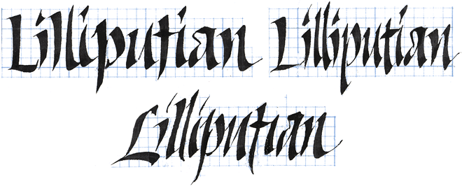
The Lilliputian series
 Appendices
|