Gallery
The invitations, envelopes and marriage vows below are samples of my professional work. I no longer take commissions but am happy to refer those interested in such work. (See Contact page.)
Sections: General Invitations Marriage Vows
 Client: Washington State University Magazine Job: Title for magazine article Challenge: To harmonize the title with the type font, the spirit of the text, and a facing full-page photograph of a Native American petroglyph. The image, composed of bold rough-edged geometric designs, is surrounded by a delicate arabesque of dried grasses. |
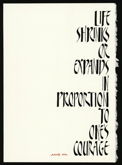
 Joy Text: joy liberating the mind A calligraphic experiment with the expressive and symbolic use of letterform. |

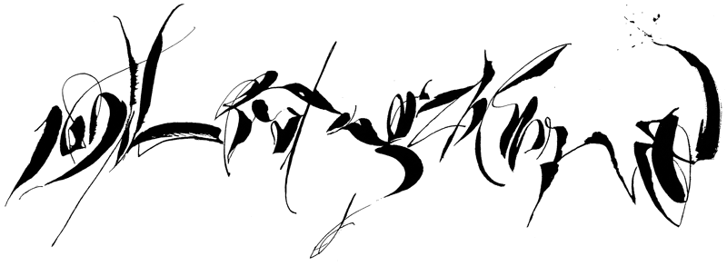
Liberating the Mind
Text: This work breaks the rules of conventional writing for the sake of giving shape and form to the spirit of the text. As the author of these lines, the words have a deeply personal meaning for me. At the time of making this piece, I was absorbed with the communication of its feeling: the lightness and joy intrinsic to liberation. Only upon completing it did I discover further significance: liberation from conventional letterform. Symbolically, then, the unfamiliar lines of these letters may represent a break from habitual social convention where habitual reaction, the trained performance of writing, is replaced by conscious investigation. |
 Personal work: the pen at play! |
Client: NBBJ, international architectural firm Job: Hand-calligraphed original pieces for new associates Challenge: To create a piece that in some way interprets/embodies the spirit/meaning of the text. For the second quote by Anaïs Nin this meant choosing a flush right margin, bringing the text close to the page edge, and creating a non-conventional alphabet style. |
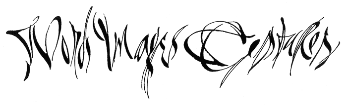 Client: Director of “Responding to Our World: Words, Images, Gestures,” an international calligraphy conference at which I was invited to teach in 2007 Job & Challenge: To create a unique visual design for “words images gestures” |
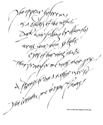 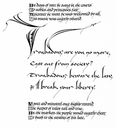
These pieces were inspired by songs written by my husband, singer/songwriter Mick Read. In collaborating on a book, Lyrics, I rendered his words calligraphically — interpreting the music through letterform, but not sacrificing legibility. In Phoenix, the first verse of a passionate love song, I wanted to express the energy of passion through the vigor of my strokes. The lines of music sound like a surging sea, swelling and subsiding. The historically-influenced style used for Troubadour, with its melodic lament of cultural loss, seemed in harmony with the song’s tone and feeling.
|
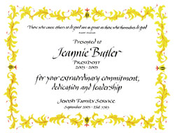
Client: Jewish Family Service
Job: Hand-created certificate — calligraphy & decoration Challenge: To interpret my client’s description of the recipient and her taste calligraphically & decoratively. |
Client: Alessandro/Weber Design; Heather Dega, designer
Job: 30 calligraphic images for the cookbook, Quick & Kosher Challenge: To make contemporary images, stimulated by designs from ornamental silver Judaica pieces, with a subtle reference to, or hint of, their Jewish background. |
Client: Director of PBS miniseries docudrama, The Secret Lives of the Inquisition
Job: Map titling Challenge: To impart historical flavor to letterform, making it legible and distinctive but not antiquated. |
Client: Café Vivace
Job: Two hand-crafted signs for this local Seattle coffee shop Challenge: To express energy and rhythmic flow in letter, word and line |
Invitations |
 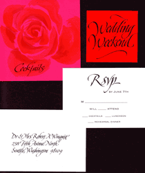
Red scalloped flaps extended from the invitation’s backing; they folded and overlapped to enclose the invitation and the inserted pieces. ‘Wedding Weekend’ had adhesive backing and sealed the flaps.
|
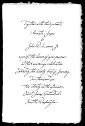
The style was inspired by a type font used for an invitation seen in a wedding magazine. The invitation was printed on handmade paper stock.
|
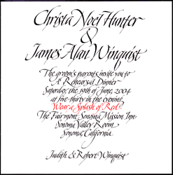
An engraved invitation in the Copperplate style.
|
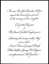
The style evolved from discussion with my clients: the descending strokes suggested sweeps to them, and I tried to make this a visual motif. The invitation was printed by letterpress on handmade paper.
|
Envelopes |
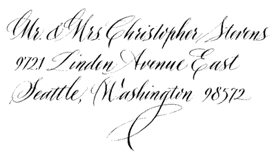
A bold energetic version of traditional Copperplate
|
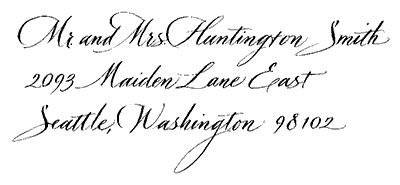
A dynamic gestural version of Copperplate caps punctuates the measured flow of lower case forms
|
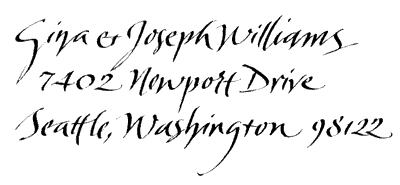
A contemporary design energized by unconventional stylistic combinations
|
Marriage Vows |
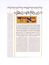
For this ketubah I suggested developing a piece based upon my recent research with original Hebrew manuscripts in England. It would encompass the ever-resonant Hebrew letter itself, with its reference to the vital, well-rooted tradition of the hand in Jewish text production: the Torah, historic Talmud and its ongoing expression (albeit translated into type!) through commentary and erudition. As if to emphasize its significance further, our choice of decoration was also from the manuscript tradition: a ‘word panel’, the embellished first word of a text, analogous to the illuminated ‘versal’ of our Roman manuscript heritage. The text was also designed to refer more specifically to marriage, with a chuppah (traditional marriage canopy) subtly employed to provide ‘page’ structure.
|
-th.jpg) -th.gif) -th.gif)
My clients expressed interest in the Asian calligraphic tradition, and a desire to create a contemporary piece with references to tradition. The latter we find in the understated word panel, as well as in the subtle separation of the top 4 lines — the traditional ketubah preface which relates the basics of time, place and participants. The text, written in a contemporary alphabet style of my own design, perhaps echoes the Chinese calligraphic tradition with its emphasis on energy and movement, through its extended strokes and its stroke shapes. (It was thrilling to take this alphabet design and, for the first time, use it as a written script.) The accompanying quotes, written vertically, reference this tradition more directly. The decoration, if not obviously belonging to this tradition, was stimulated by an exhibit at the Seattle Asian Art Museum!
|
 -th.gif)
In this ketubah my clients wished to blend elements from the three distinctive traditions—Jewish, Quaker and Buddhist—of their backgrounds. In fulfilling this desire we brought together a Hebrew quote, the preface to the ketubah formulary, the Quaker formulary and witnessing, and the Chinese character for love. We also incorporated the popular Hebrew text, “I am to my beloved as my beloved is to me”, from The Song of Songs, by ‘writing’ this line, in tiny letters, to serve as signature lines for both bride and groom. By doing so we made reference to two unique features of the Hebrew manuscript tradition: 1) ‘micrography’: tiny writing used to ‘draw’ ornamental figures for the embellishment of texts, and 2) ‘dilation’: the scribal technique of extending horizontal strokes for the justification of texts. My client’s desire for the whole piece to have a sense of movement allowed me to experiment with the placement of the lines of text, as well as with the ‘linearity’ of the flowers, their stems and tendrils. It is always a wonderful challenge for me, as a calligrapher, to create harmony between the Roman and Hebrew styles, and to give life and contemporary expression to these traditional alphabets.
|
Working with a ketubah design found on the internet my clients chose text styles from my portfolio — a traditional Sephardi Hebrew and a flowing italic — and, for the border, a flower to be used in their chuppah, Bells of Ireland. Since the floral border was to be relatively large in relation to the light text, my challenge was to harmonize their respective weights. And, since “Bells” grow on upright stalks I gave myself license to draw them ‘decoratively,’ adding tendrils and berries at my client’s request.
|
Hebramaic: Simplicity need not be simple! Here, the choice of a square format, with its connotations of a foundation, balance and solidity, acknowledge the earnest, serious side of a marriage agreement. This mood, however, is leavened by numerous subtle, intriguing details of text design. First, the choice of style is not traditional; rather, it is a postmodern hybrid mixing the notably square, formal Hebrew with its ancient, cursive ancestor, Aramaic. (I designed this style which I call Hebramaic, see Publications.) Second, there is a ‘play’ with symmetry to create balance: only the last three lines observe page symmetry while the above text adheres loosely to a left margin with ragged right. There is also uncommon spatial symmetry between the top and bottom 3 lines of text; these portions have greater distance between their lines, by the same amount, than the text. Unlike the text body, these triads each record the bride’s and groom’s full names. For additional ‘graphic decoration’ we recognized the relative importance of words by varying their size and weight.
|
My clients asked me to create an unconventional ketubah, one which expressed gentleness and movement, and also included a poem translated from English into Hebrew. To begin, my clients selected a contemporary alphabet style of my own design; the style, which I call ‘Bet’, had its ‘debut’ in this ketubah! (It may be viewed on the Publications page: Hebrew Calligraphy Styles.) I was also provided with a book of Japanese ornamental designs, a few of which were marked for their particular appeal. Since overall design was left completely to me, I experimented freely while being guided by the ‘spirit of the work’ as noted above. Upon selection from numerous ‘roughs’, an enlarged poem, a soft palette and a play of calligraphic line for text and letterform became the basis for fashioning this work.
|
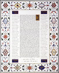
This piece displays some of the intricacy and complexity a ketubah may express, visually as well as symbolically. Texts: a conservative formulary upholds tradition in the central text block, solid and justified, while personal vows in the adjacent columns, with their ragged right margins, relate to it with seemingly conversational brio. Symbolically, these vows hold the position reserved for commentary, thus illustrating the compatibility of creativity and responsiveness with tradition. In this ketubah the word panels act visually to hold the text in place, to balance the weight and activity of the border; and, symbolically as word panels, they represent beginning points which serve to launch the action, conventionally, of reading, but placed in the four corners of a ketubah text may be said to represent a cornerstone for marriage. The chosen words are certainly worthy: love, honor/respect, loving-kindness and social justice. As inspiration for the border design my clients presented me with 20 pages of downloaded Turkish tile designs. They asked me to incorporate images of their individual and common interests; to accomplish this, I created vignettes placing their personal interests in the right and left bands with their shared ones top and bottom.
|
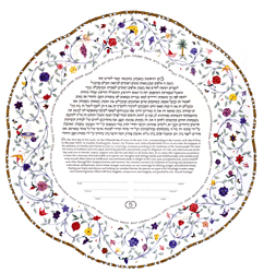
The unique shape of this ketubah came from a cookie exhibiting like contours; my clients handed it to me, smilingly, as we embarked upon the subject of design. Its six scalloped lobes hint gently at the Star of David, one of six symbolic motifs also woven into the floral vine. The Hebrew and English texts are ‘stacked’ within a circle, a shape repeated beneath the signature lines in interlocking rings composed of the couple’s Hebrew names. The border is ‘outlined’ by two lines of text from the Seven Wedding Blessings.
|
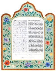
With its contoured triangular apex this ketubah echoes a historical style motif; a similar shape is occasionally found, inverted, at the document’s foot. The Hebrew and English texts are written with bold strokes to visually balance the color-saturated border paneling; and, in this work, they are designed to face, or ‘mirror’, one another. Since the Hebrew text is generally shorter than the English, fitting the texts within the same text area is a scribal challenge. The Lotus and Poppy were chosen for their spiritual and personal significance.
|
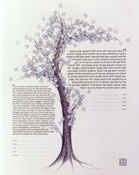
This tall flowering “Tree of Life” suggested a sort of ‘organic’ integration of text and image: with each text facing and opening to the tree’s branches from its natural margin: Hebrew reading right to left and English left to right. A flower, ‘picked’ from the tree, serves, in the position of signature chop, to balance the design. Written in both Hebrew and English the tiny text surrounding it is again from The Song of Songs, “I am my beloved’s and my beloved is mine”* (Perhaps, lending to the ketubah the congenial concept of love as signature, as itself the vital agent which authored, or created, the marriage document.)
*Since the Hebrew text does not use the possessive, I have offered an equally valid, if less well known, translation to couples: “I am to my beloved as my beloved is to me.” |
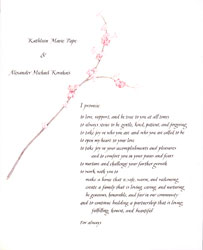
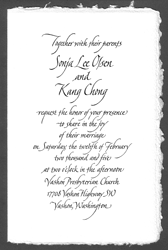
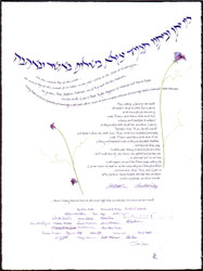
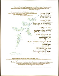
This couple planned to marry in February and wanted a simple document to express their vows. For its adornment they chose a single blossoming branch, for its page design they requested ample visual space, both of which signified promise and openness to them.
|
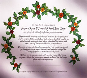
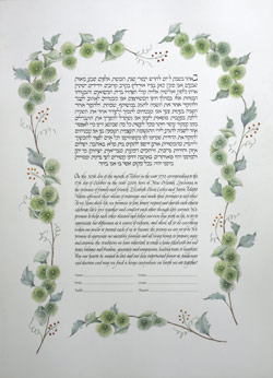
Although not joining in a Quaker union, this couple wished to use its tradition of witnessing: whereby all guests, in addition to bride and groom, sign beneath the marriage vows. (Image does not include ‘signature block’, which was positioned below the last line of text.) My clients asked me to create a wreath of bold, richly-colored leaves and flowers to overarch the text. For the calligraphic text to balance its intense saturated color and dynamic exuberance, I developed a variant of the Italic alphabet style and, to add slightly more visual weight, ‘double-stroked’ the ascenders of the letter ‘d’.
|